Labels do more than identify what’s in the bottle or jar. They whisper your brand’s personality before anyone reads a single word. The right label makes someone stop scrolling, reach for your product on a crowded shelf, or remember you months after their first purchase. It’s not just paper and ink; it’s your handshake with every potential customer.
Here’s what many Australian businesses get wrong: they treat labels like afterthoughts. They pick generic templates, rush the design, and wonder why sales feel flat. But custom labels Australia brands are choosing tell complete stories through colour psychology, texture choices, and clever visual hierarchy. These labels don’t just sit there looking pretty; they create emotional connections that generic stickers simply can’t match. Your label is working 24/7 as your silent salesperson, so why would you settle for something that blends into the background?
When Your Label Looks Cheap, People Assume Everything Else Is Too
The Brutal Truth About Supermarket Aisles: Walk down any shop aisle and you’ll spot it instantly. Dozens of products fighting for attention, most with labels so boring they’re practically invisible. Customers make snap judgements in under three seconds. If your label screams “budget afterthought,” they’ll assume what’s inside matches that vibe. Harsh? Maybe. But that’s exactly how real people shop when they’re standing there with a hundred other options staring back at them.
What Actually Stops Someone Mid-Scroll: Think about the last time packaging made you do a double-take. The label probably had colours that just felt right for what it was selling. Maybe the typography looked like someone actually cared, not like they grabbed the first free font they found. These aren’t happy accidents. They’re smart choices speaking directly to the people you want buying your stuff, without needing to shout about it.
The Sneaky Psychology Behind Colours That Sell
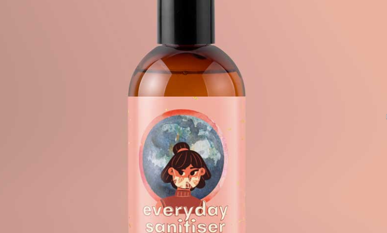
Why Some Colours Just Feel Right: Warm amber and deep burgundy make your craft beer feel like a cosy pub night. Cool blues and crisp silvers whisper “fresh and clean” for skincare before you even mention ingredients. Earthy greens do the eco-friendly heavy lifting without you needing to plaster “green” all over everything. People clock these visual cues faster than they can read your brand name. Get this bit wrong and you’re basically asking customers to work harder than they want to. Sustainable packaging choices matter here too, especially when your audience cares about where things end up after the bin.
When Touch Tells a Different Story: Here’s something wild: people judge quality by feel before they even look at the price tag. Matte finishes feel expensive and confident. Glossy screams fresh and energetic. Textured materials make people think “handmade” and “someone cared about this.” If your label feels flimsy in their hands, guess what story they’re writing in their heads about what’s inside? Not a great one, that’s for sure.
The Little Things That Make People Remember You Exist
Fonts That Do More Talking Than You’d Think:
- Clean, simple fonts feel modern and no-nonsense, brilliant for health stuff or anything tech-related.
- Traditional fonts carry history and trust, perfect for wines or businesses trading on family recipes and heritage.
- Flowing script adds warmth and personality, gorgeous for beauty products or fancy food that wants to feel approachable and premium.
- Custom lettering screams “we’re different,” though it’ll cost you more time and money to get right.
Why Your Whole Range Needs to Look Like Family
People Spot Patterns Without Trying: Customers shouldn’t need a degree to figure out which products are yours. Same colour families, similar fonts, matching layout vibes across your range? That’s how someone who loved your chilli sauce finds your tomato relish without hunting. That recognition thing builds trust like nothing else. When people know what to expect from you, they’re way more likely to grab your stuff again without overthinking it.
Breaking the Rules When It Counts: Being consistent doesn’t mean being identical and boring. Limited runs, Christmas specials, or fancy premium versions can go a bit wild while keeping enough familiar bits. Think craft breweries doing mental artwork for special releases but keeping their logo exactly where regulars expect it. You’re saying “this one’s different” without confusing people about who made it in the first place.
The Sales You’re Losing Without Even Knowing It
The Customers Who Never Gave You a Chance: This is the bit that properly stings. You’ll never meet the people who walked straight past your product because nothing grabbed them. You won’t get feedback from shoppers who decided your stuff looked dodgy based purely on the label. These invisible losses stack up fast, eating your profits without leaving any clues you can actually fix. It’s like bleeding money in slow motion and not knowing where the cut is.
How Bad Labels Haunt You Later: Rubbish label design doesn’t just kill sales today. It shapes how people remember your brand for ages afterwards. If your labels scream amateur hour or corner-cutting, that impression sticks like glue even if you upgrade later. First impressions in shops are basically impossible to undo once they’re set. Getting this right from day one saves you from expensive “please forget what we looked like before” campaigns down the track.
Stop Treating Your Label Like an Afterthought
Your label isn’t just ticking a box or meeting legal requirements. It’s the first proper chat your product has with everyone who might buy it. The colours, the materials, the whole design story either creates want or creates nothing at all. When shelves are packed and attention spans are short, labels that actually reflect your quality make the difference between flying off the shelf and gathering dust.
Smart label design pays itself back through people actually noticing you, remembering who you are, and trusting you enough to buy again. Your product’s good enough to deserve packaging that shows it off properly. Request a quote today and get labels that tell your story the way it deserves telling.